House of Observation
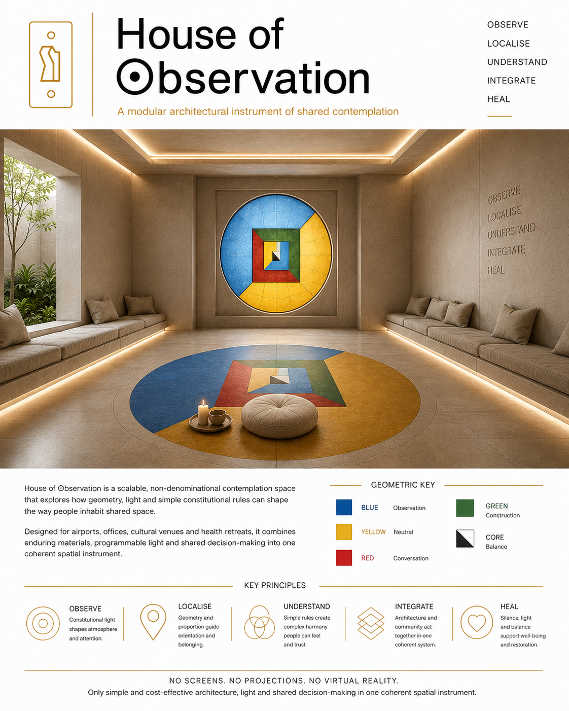
H⊙use of ⊙bservation, a non-denominational contemplation space, part of the S⊙AL City Living Lab project
The communal contemplation space proposed within the Metamathics H⊙use of ⊙bservation design proposal is not conceived as a chapel, branded wellness room, or decorative quiet zone, but as a shared architectural field in which silence, orientation and difference can coexist without requiring a single religious image or function. Its purpose as a scalable design language is to give airports, offices, cultural venues and public institutions a recognisable calm, non-denominational space where prayer, meditation, grief, reflection and simple withdrawal from noise can all be held by the same room. Geometry and colour control supplies the common language: floor pattern, occupancy allocation, light control, seating, threshold and focal panel create structure without prescribing belief. In that sense, the room becomes a civic instrument of attention — a place where individuals may arrive with different practices, but encounter a shared condition of proportion, restraint and mutual respect. https://www.dottheory.co.uk/paper/context-sensitive-modelling-in-practice
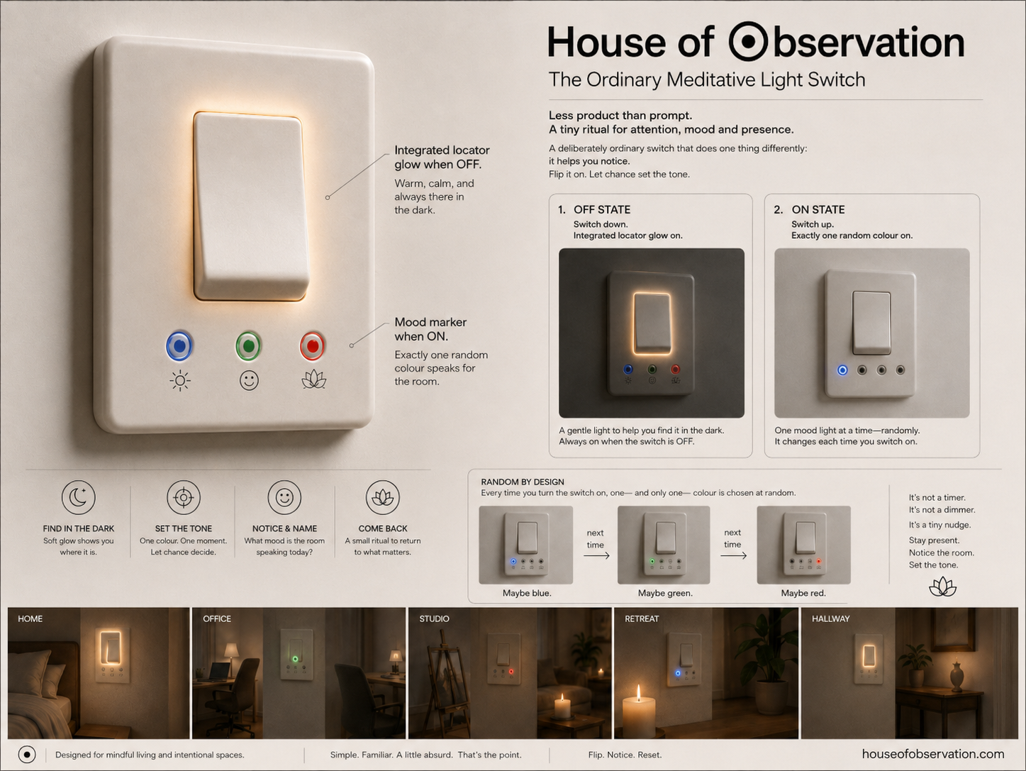
LightSwitch, a novelty home and office feature for perspectival dexterity.
The Light-switch, a commercial H⊙use of ⊙bservation derivative, can be framed as a small domestic training device for perspectival dexterity: not a tool that improves attention by instruction, but an object that repeatedly asks the user to notice the decision which frame they are entering. In the perspectival-dexterity proposal, the relevant skill is the ability to recognise an operative perspective, enter or leave it deliberately, adopt another frame with different rules, and preserve enough meta-awareness not to mistake one local interpretation for the whole event.
The House of Observation switch miniaturises that operation. In its architectural form, the proposal assigns blue to Observation, red to Conversation, green to Construction, and yellow to Neutral, with the rule that agreement produces colour while incompatible selections return the room to neutral yellow. As a household object, the switch turns this into a daily micro-practice: when off, the warm locator glow marks neutral availability; when switched on, a random RGB mode interrupts habit and asks the user to inhabit a frame rather than merely illuminate a room. Blue can invite reflective attention, red can admit relational or conversational presence, and green can orient the user toward making, planning or work. Its usefulness is precisely that it is slightly absurd and ordinary: like a philosophical Pet Rock for the wall, it converts an automatic gesture into a minimal rehearsal of frame-entry, frame-recognition and return.